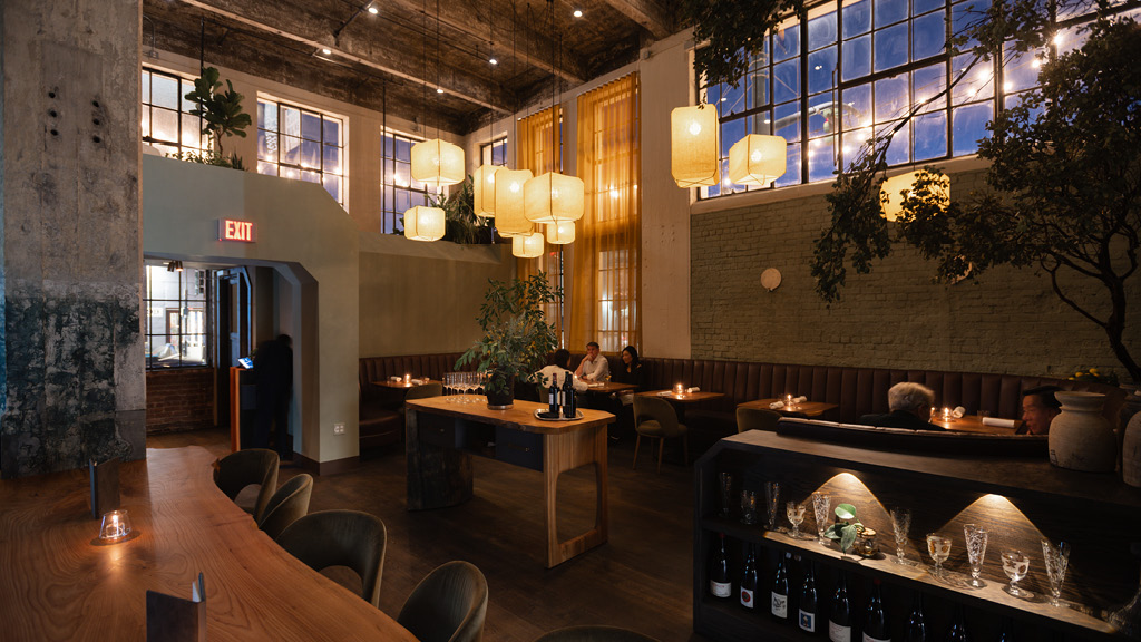
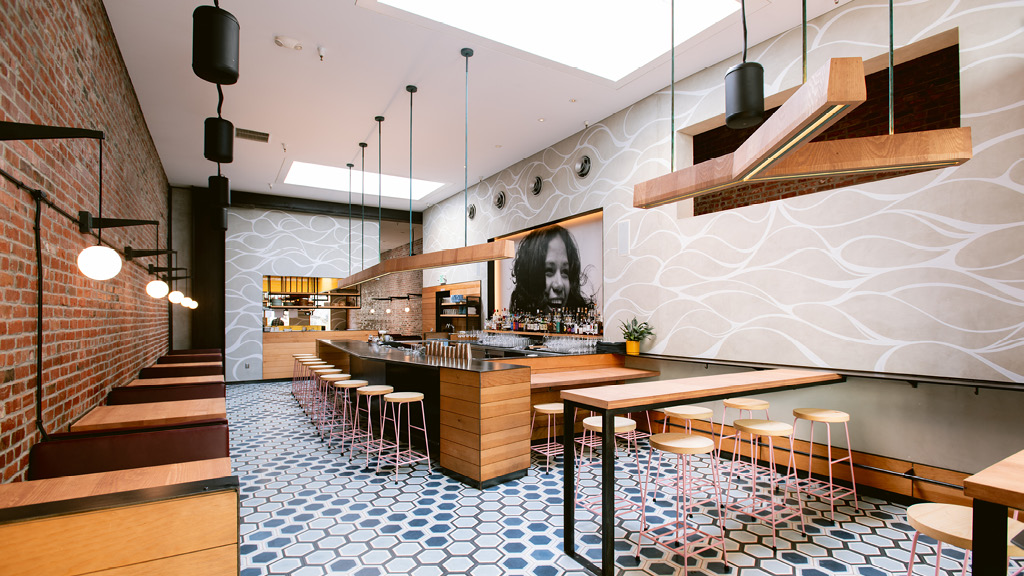
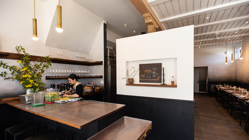
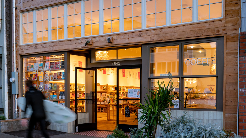
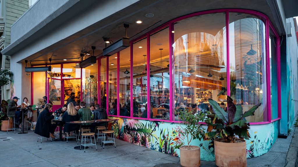
Wolfsbane is a mythical herb that can hold the inner werewolf at bay. This space was designed as the den of a feral beast that is not too far gone to indulge in a sophisticated feast. The dark cork walls help with acoustics, smell lightly of toasted tobacco, and evoke an earthen cave. Elm and redwood form the tables and show stations with a mixture of solid crisp detail and natural edges. The walls are a soft lime wash with accents of abstract artful paint in the tunnel entry and private dining.
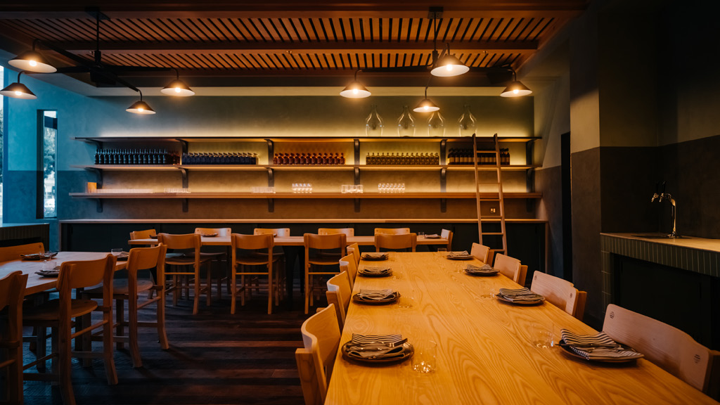
Hedge Coffee honed their craft serving at events from mobile espresso carts, roasting coffee in shared workspace. When they set about designing their own permanent home, we helped make it feel like a party, like a club. Inspired by the pine forests of the founders’ home countries, we created a woodsy dark space, a modern forest floor. A surprising opening in the roof creates a welcoming outdoor entry patio complete with a towering redwood tree.
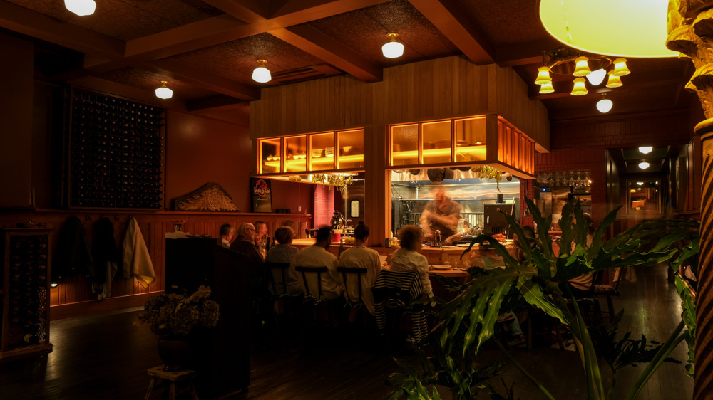
La Cigale focuses all of its culinary prowess on a single 14 seat cypress counter in front of a wood fired grill. Dark wood floors, rich red walls, redwood paneling and antique lighting make for a dramatic yet intimate setting.
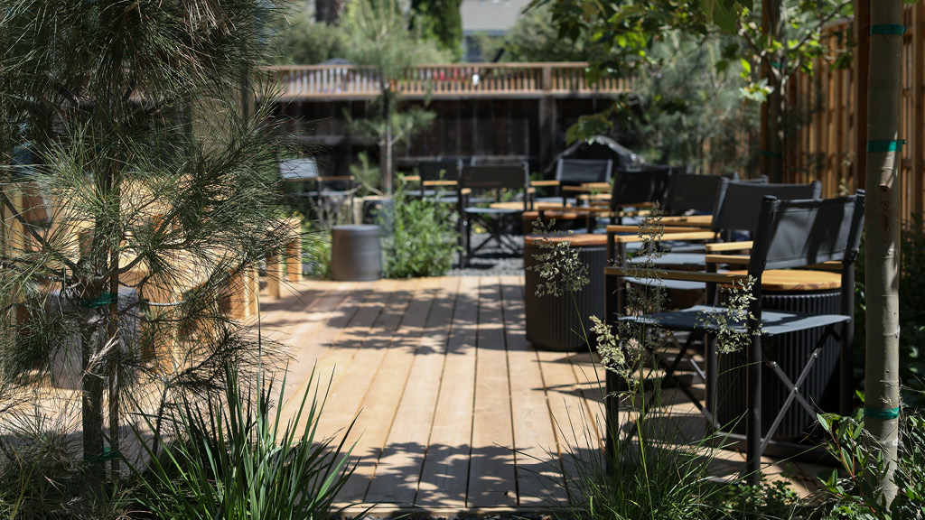
This is the jumping off point for all your adventures with Obsidian Wine Co. A welcoming workspace and tasting room that opens wholeheartedly to a well-kept native garden. The plants, materials, and projected images tie you back to the mountain in Lake County where Obsidian grows their grapes. The elegant and hefty custom furniture is made from Hungarian oak by the same craftsmen who make Obsidian's wine barrels in Kádár Hungary.
We were imagining a space for those who are so devoted to a particular thing that they are driven to taxonomy - name it, draw it, celebrate every instance. It is a way of understanding your world, obsessive study; a way to organize your mind and your days. Understanding becomes a practice. This place is for collectors, devotees, and students. So, for Bar Agricole - immersive color, warmth, and shadows. It’s when you dive under to escape a breaking wave, the ocean’s roar becomes a purr, and everything is calmer below the surface.
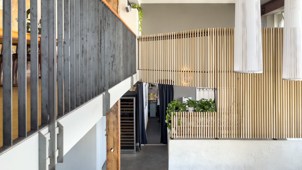
Tucked into the fabric of San Francisco, Frances is one of those experiences that has quietly meant so much to so many over the years. It was an honor (and a tiny bit intimidating) to design new touches for the space. Subtle but decisive improvements were made during this refresh. We re-worked the ceiling for acoustics and aesthetics. The lighting was completely re-done while introducing texture to further ground the space, and reinforce the cozy romantic scale.
You don’t choose your family; they happen to you. Family is messy, often difficult, and sometimes all you have in common are your differences. But you always come back to the table together, and someone is always going to ask: “have you eaten yet”? Everyone is going to share a story. Together, by dedication, with strangers you have cared for your whole life, you build something new and fortifying. This is that active space for enjoying differences among layers and layers of conversational design. It is meant to be a homespun history – to feel like a friend’s big family gathering that you want to get invited to.
End of content
No more pages to load
